Bringing calm and tranquility into your home often starts with color. The colors you choose for your walls, furniture, and accessories can deeply influence how you feel in a space. Calm colors promote relaxation, reduce stress, and create an inviting atmosphere where you can unwind. But with so many options available, how do you select the best hues for a peaceful home? Here are practical tips to help you choose calm colors that suit your style and space.
Understanding Calm Colors
Before diving into specific colors, it helps to know what qualifies as a calm color. Typically, these are colors that are soft, muted, and not too bright or overwhelming. They often include:
– Cool tones: Blues, greens, and soft purples
– Neutrals: Light grays, beige, and off-white shades
– Earth tones: Warm taupes, soft browns, and muted greens
These colors tend to have soothing qualities, making them ideal for bedrooms, living rooms, or any area where you want to relax.
Tips for Choosing Calm Colors
1. Consider the Room’s Purpose
Begin by thinking about how you use each room. Calm colors will work differently depending on the space:
– Bedroom: Soft blues, pale lavenders, and gentle greens help induce sleep and relaxation.
– Living room: Warm neutrals and calming greens create a welcoming, restful environment.
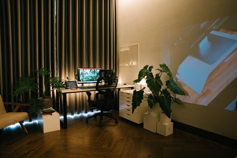
– Home office: Light blues and muted grays can improve focus while maintaining calmness.
Matching the color to the function of the room can improve both aesthetics and comfort.
2. Test Colors in Different Lights
Colors can appear dramatically different depending on lighting. Natural light, artificial lights, and the time of day all affect how a color looks.
– Test paint samples on your walls and observe them at various times.
– Consider the direction your windows face; north-facing rooms often benefit from warmer calm tones.
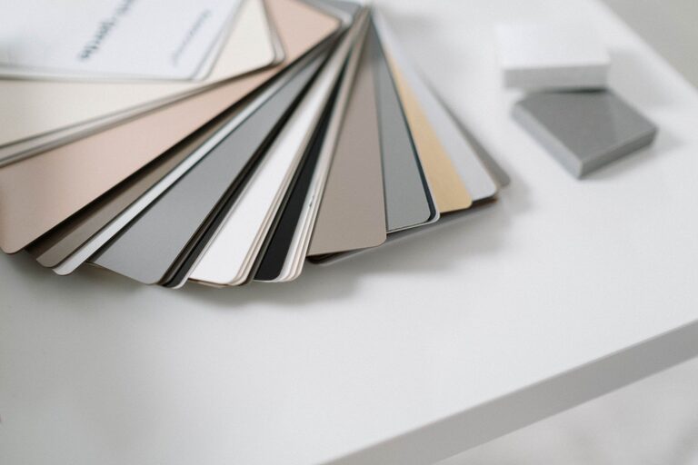
– Use sample boards or large swatches to see how colors interact with your furniture and flooring.
3. Use a Color Palette
Choose a palette of 3-5 complementary calm colors rather than a single shade. This creates balance and visual interest without overwhelming the senses.
– Start with a primary color for walls or large furnishings.
– Add secondary colors for accents like cushions, curtains, or art.
– Include neutral tones to ground the palette and prevent it from feeling too monochrome.
You can find inspiration online or create your own palette using color tools and apps.
4. Emphasize Matte or Soft Finishes
The finish of paint or fabric influences how a color feels. Glossy or shiny finishes can be more stimulating, while matte or satin finishes reflect light softly and contribute to a calm atmosphere.
– For walls, opt for matte or eggshell finishes.
– Choose soft fabrics such as linen or velvet for upholstery in calming colors.
– Avoid highly reflective surfaces in calm color schemes.
5. Balance Cool and Warm Tones
While cool colors like blues and greens are traditionally calming, a palette that is too cool can sometimes feel cold or sterile. To prevent this:
– Add warm neutrals like beige, soft browns, or warm grays.
– Incorporate natural materials such as wood or woven textures.
– Use warm-colored accent pieces in subtle ways.
This balance ensures the room feels cozy yet peaceful.
6. Bring Nature Indoors
Colors inspired by nature tend to be inherently calming because they remind us of the outdoors. Consider these options:
– Soft greens from leaves and moss
– Sky blues and soft ocean hues
– Earthy browns and stone-inspired grays
Pairing these colors with natural elements like plants, wooden furniture, or stone accessories enhances the overall sense of calm.
7. Avoid Overly Bright or Saturated Colors
Bright reds, neon pinks, or vivid oranges tend to energize a room rather than calm it. If you love these colors, consider using them sparingly as accents rather than main colors.
– Use brighter colors in throw pillows, artwork, or small decor pieces.
– Keep walls and large surfaces in more muted, calming tones.
This approach allows you to enjoy your favorite colors without disrupting a peaceful atmosphere.
8. Personalize Your Color Choices
Ultimately, calmness is subjective. What feels soothing to one person may not to another. Trust your instincts and personal preferences.
– Reflect on which colors naturally make you feel relaxed.
– Consider colors you gravitate toward in clothing or nature.
– Don’t feel pressured to follow trends; timeless calm colors often work best.
Final Thoughts
Choosing calm colors for your home is a rewarding way to create a peaceful retreat. By understanding your space, testing options, balancing tones, and personalizing your choices, you can design an environment that helps you relax and recharge. Remember that calm colors don’t need to be boring — with thoughtful layering and textures, you can achieve a soothing yet stylish home.
Take your time exploring colors, and enjoy the process of transforming your home into a calming sanctuary.
About the Author